Carving out the space, Or Painting with a Mellonballer

When I was a kid I had chores. One that I liked was using one of those funny looking scoops to scrape out little balls of watermelon when we were making fruit salad. Watermelon was soft, and compared to say cantaloupe, the going was easy. Into the flat surface of a half watermelon you'd go and in a few minutes you'd have carved out a whole cave. To a kid with a good imagination, this was heaven.
I though of this years later when I read that George Seurat had described painting as "the carving out of space." It's more than just that of course, but it's intriguing that a painter who's so associated with elegantly composing his flat shapes and covering his canvas with intricate pointillist dots would choose to talk about carving out space. Depth for a painter has expressive purpose.
Here's a real celebration of deep space by the 19th century German artist Caspar David Friedrich.

Friedrich wants you to feel you can go somewhere and invites you to pick you way back into his far distance, stepping from mountain ridge to mountain ridge. As you go you see the land under your feet gradually changing, getting lighter and turning from a dark warm brown to a whispering faint light blue.
Friedrich understood that space in a painting can have a deeply resonant emotional quality.
Think for a moment of dream you've had where someone or something unsettling is pursuing you. As they or it comes closer you feel more anxious, as the distance between you widens, you feel relieved. Or the opposite. Imagine you're dreaming of someone you have missed terribly who unexpectedly reappears. They come closer and you're overjoyed. If they begin to drift away from you again the pain of loss is palpable. Evoking the feel of deep space unlocks a reservoir of feeling in the viewer. This is something landscape painters revel in.
Below is my painting North Passage, oil on canvas, 45 x 60", 2011. It's a composite of memories I pulled together from New England mountains, the coast of Maine, and Lake Champlain between New York and Vermont (why settle for one favorite place when you can borrow from them all). It's got more variety of forms in it than the Friedrich, but the same thinking is evident to make different spaces within it feel differently.
Primarily it's done with color. The foreground water and islands are mid-toned and cool, a string of forest on the far shore is injected with extremely light yellows and oranges. Then dramatically darker red mountains fill the next zone. Finally the sky divides into three basic levels- more subtle oranges in the closer clouds, a veil of overcast gray violets behind that, and most distant of all a streak of bright cool blue in a narrow gap in the clouds running all across from left to right.
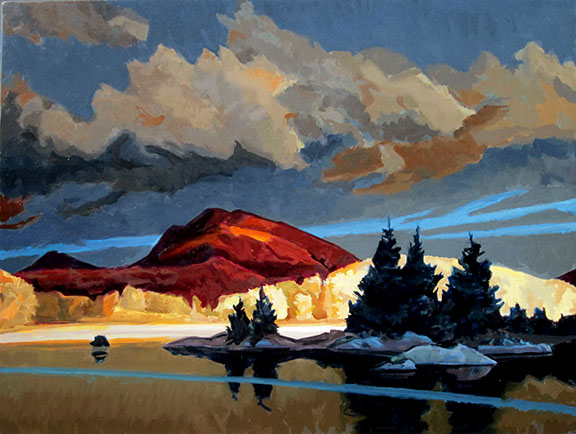
The color is fanciful, but the orderly progression of space jumps from one overlapping plane to the next. In many ways I consider it a highly truthful painting- go out and study a mountainous vista anywhere. The first thing that hits you is the enormity of the deep space. We are small, it is big and often highly dramatic. When landscape panorama is well painted it can sweep you away.
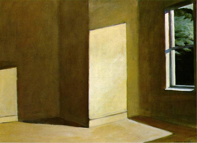
Here's another new painting of mine, Rooms by the Sea, oil on panel, 14 x 21", 2013. It's more modest in its scale and feeling, but the key idea remains the same. It was painted in the studio Edward Hopper lived in from 1934 until the mid 1960's. In this room he created some of his most widely admired canvases. One is Hopper's oil Rooms by the Sea now in the Yale University Art Gallery that was directly inspired by this corner of his painting room and its doorway leading out to Cape Cod Bay.

I began this oil in the afternoon when the sunlight shone into the far bedroom and cast a yellowish glow throughout that farther space. In reality, the close doorway didn't get direct sunlight on it (that wall faces due north) and the entire front space was a cool blue grey. I decided to borrow the light direction Hopper used in his version of this doorway because I liked the idea of casting a diagonal shadow across the foreground. I knew in real life this invented sunlight would have changed the color of the entire front room, but I chose to ignore that in favor of its actual cool blue gray tones.
Like in my North Passage oil above, I think it's again a truthful painting in the way it makes each of the two rooms feel different from each other. In real life Hopper's bedroom is tiny and cozy. His painting room where my easel was set up was just the opposite with its high ceiling and vastly larger size. To exaggerate the color difference between the rooms was a way to speak to how differently each space felt as you walked from one to the other. Inventing color contrasts was a way to give the viewer a sense of that.
